

When I came to this account, certain things were already almost set in stone, such as the typeface, red star, and the consistent red on black color scheme. The remaining qualities were yet to be determined with any finality. The majority of work that this account entailed was creating a cohesive and rigid brand platform that all consumer touch points should be based off of. One of the early distinctions we had to make about the brand is that it should be a t-shirt company first and a social activism company second. This led us to develop more product lines that we feel resonate with our customers as well as fit the values the company stands for. The first t-shirt design I created for this client aims to highlight the emergence of urban agriculture in Portland.

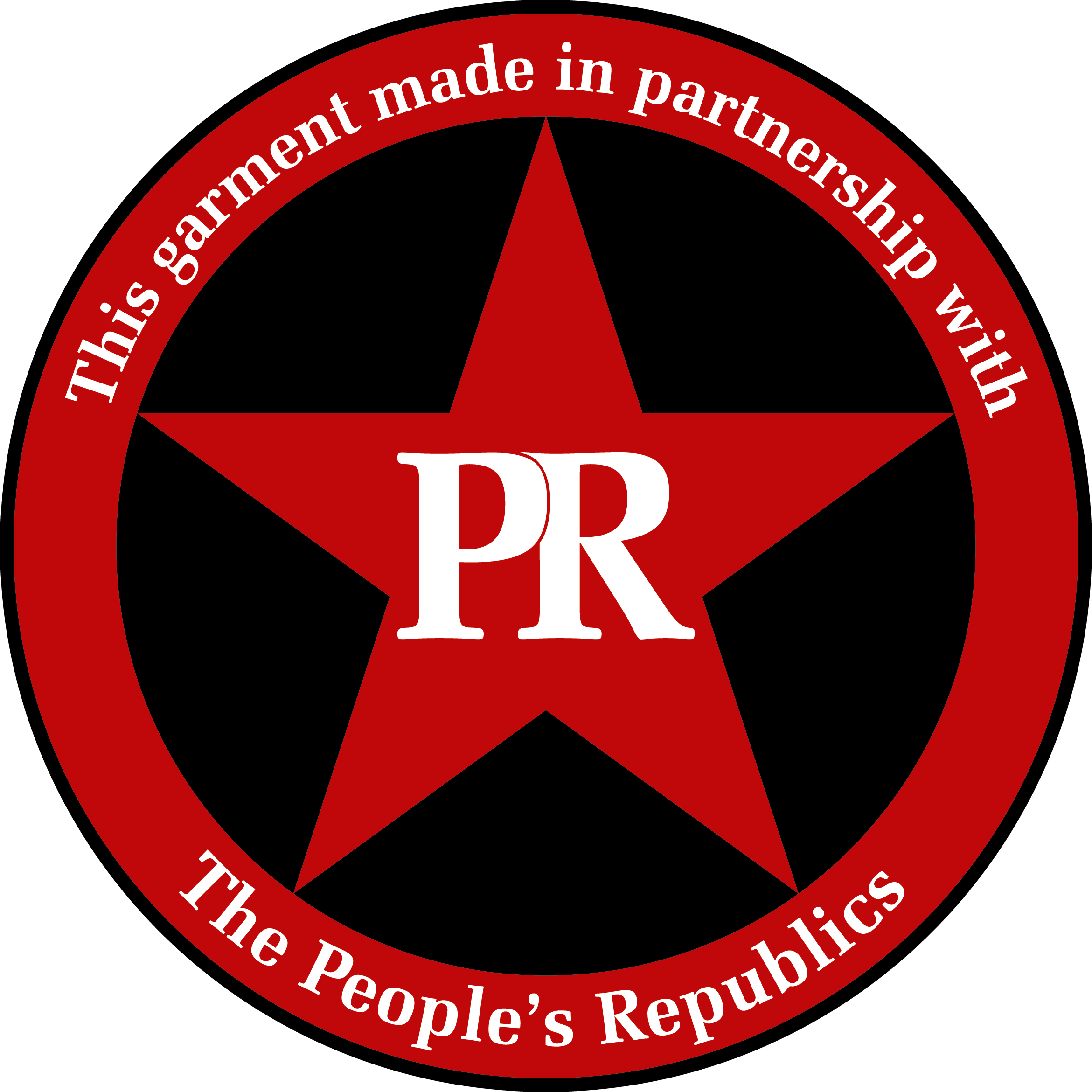
The star in the lower left-hand corner of the shirt is the brand mark that reads, "This garment made in partnership with The People's Republics." This design will be in the same place on all shirts; it will be a tag which is sewn on, similar to basketball jersey tags. This will assure that these shirts are recognizable as Peoples Republic of Portland's shirts even when they are a collaborative piece between the Peoples Republics and other organizations. At the end of my time at Fir NW, the last idea pitched to the client was to piggy-back off of the urban agriculture idea and cooperate with a local organization, Farm My Yard. Here are a couple ideas I pitched at the end of my terms with Fir NW.

